
Project-Based Learning for Scatter Plots and Line of Best Fit
There is one question that follows the statistics unit around. A student plots a few points, draws a line through them, and then looks up and asks the thing every eighth-grade math teacher has heard: "When am I ever going to use this?"
It is a fair question, and most scatter plot lessons do not have a good answer for it. The data is about study hours and test scores, or shoe size and height, and the student can tell that nobody outside the classroom actually needs that line. They draw it because the worksheet asks for it. They will forget it by June.
This post is about the other path. Scatter plots and the line of best fit are among the most genuinely useful tools in the entire middle school curriculum, because businesses use them every single day to make real decisions about price and inventory. The trouble is not the math. The trouble is that worksheets strip out the one thing that makes the math matter: a decision that depends on it. Project-based learning puts that decision back.
Below is a framework for building a connected, real-world statistics project around 8.SP, the design choices that make it work, and a worked example you can hand to your class without building anything yourself.
Why the Statistics Unit Is the Hardest One to Make Real
Most math standards have an obvious hook. Proportions show up in recipes and maps. Geometry shows up in anything you build. But the eighth-grade statistics standards sit at an awkward distance from a student's daily life. Reading bivariate data, fitting a linear model, interpreting slope and intercept in context, building a two-way table: these are analyst's tools, and a thirteen-year-old has never had a reason to act like an analyst.
That distance is why so many scatter plot activities default to data collection. Students measure each other's arm spans, survey the class about screen time, and plot what they find. It is hands-on, and it has real value. But it also has a quiet weakness. Once the scatter plot is drawn, the project is essentially over. The line of best fit becomes a decoration on top of data that no decision depends on. Students describe the association, write the equation, and stop, because there is nothing the line is for.
The standards themselves point at the fix. 8.SP.A.3 asks students to use the equation of a linear model to solve problems in context and to interpret slope and intercept as real quantities. The phrase that matters there is solve problems. A linear model earns its place when it feeds a decision, and a decision only feels real when getting it wrong has a cost. That is the heart of what project-based learning can do for this unit that a worksheet cannot.
What a Project-Based Approach to 8.SP Actually Looks Like
Project-based learning is not the same as a fun activity or a themed worksheet. The defining feature is that students work toward an authentic outcome over multiple steps, and each step carries forward into the next. The math is not the assignment. The math is how you get the outcome.
For the statistics strand, the most natural authentic outcome is a business decision, because business is where lines of best fit genuinely live. A store has past sales data. It needs to decide what to charge and how much to stock. Those two questions are exactly what a linear model answers, and they are concrete enough for an eighth grader to hold in their head.
A strong project arc for 8.SP has a spine that looks like this:
Start with data the student did not choose. Real businesses inherit messy history, they do not run tidy classroom experiments. Give students a scatter of past sales at different prices. This is where 8.SP.A.1 lives: describe the direction, the strength, and notice anything that does not belong, including outliers.
Turn the cloud of points into a model. Students fit a line to the scatter and write it as y = mx + b. This is 8.SP.A.2 and A.3. The slope is not an abstract number here. It is how many fewer units you sell for every dollar you raise the price, and students can say it in those words.
Use the model to make the first decision: price. A linear demand model turns directly into a profit curve. Students do not need quadratic algebra to find the best price. They can read it off the peak of the curve, which keeps the work squarely inside eighth grade while still being the real method a business would recognize.
Use the model to make the second decision: quantity. The same model predicts how many units will sell at the chosen price. That number becomes a purchase order, usually against a fixed budget, which folds in proportional reasoning and rational-number arithmetic from earlier grades.
Let the prediction meet reality. This is the step worksheets never reach and the step that teaches the most. Actual sales never match the model exactly. When students compare what they predicted to what really happened, they finally understand what a model is: a tool that predicts, not a promise that something will occur.
Settle up and look back. Profit against a target, leftover stock, money lost on inventory that did not sell. The final accounting is where the abstract becomes unforgettable, because the number at the bottom traces straight back to the quality of the line each student drew.
Notice that the two-way table standard, 8.SP.A.4, fits naturally at the end as a debrief: who bought what, broken down by group, read as relative frequencies to reveal an association. It is the analyst stepping back to read the crowd after the event is over.
The Design Choices That Make the Difference
The arc above is the skeleton. Whether students care depends on a handful of design decisions that are easy to get wrong.
Make the Decision Carry a Consequence
The single most important choice is that a wrong model should cost something. In a worksheet, a loose line of best fit earns a slightly lower grade and the student moves on. In a well-built project, a loose line leads to a wrong price, which leads to over-ordering, which leads to a pile of stock that did not sell and money lost at the end. The student can trace the loss directly back to the line they drew. That traceable consequence is what converts "why am I learning this" into "I want to get this right." It is also the most honest thing you can teach about statistics, which is that the quality of your model determines the quality of your decisions.
Build the Data So Each Part Teaches a Different Lesson
If every dataset behaves the same way, students learn one lesson three times. The richer approach is to make each piece of data carry a distinct idea. One product can have clean, tightly clustered data that fits a line beautifully, so students see what a strong association looks like. Another can hide a single outlier that has to be recognized and excluded before fitting, which is the whole point of 8.SP.A.1. A third can be genuinely loosely associated, so the best line a student can draw is still a rough one, and the rough fit becomes the cause of a real downstream loss. Three products, three lessons, one project.
Keep the Math Inside the Grade
It is tempting to reach for regression formulas or quadratic optimization, because that is how the "real" version works. Resist it. Eighth graders can fit a line informally by judging closeness, exactly as 8.SP.A.2 describes, and they can find a best price by reading the peak of a profit curve rather than solving for it. The project should feel like real business reasoning while staying inside tools a thirteen-year-old can actually use. The authenticity comes from the decision, not from the difficulty of the algebra.
Let the Steps Depend on Each Other
A project loses its power the moment a student can skip a step without consequence. The fix is a carry-forward spine: the scatter plot produces the fit, the fit produces the price, the price produces the order, the order meets reality. Because each output is the next step's input, a student cannot coast through the middle. A wrong answer early is a wrong business decision later, which is exactly how it works outside the classroom and exactly why students stay engaged. This connected structure is the same principle that makes project-based learning effective across subjects, and it is especially powerful in math, where one number really does feed the next.
Where Competition Fits In
A light competitive layer raises the stakes without much extra design. When students or teams are working the same scenario toward a profit target, the natural question becomes "did your stand beat mine," and suddenly the difference between a tight fit and a loose one is something students argue about on their own. Paired or small-team competition also surfaces good mathematical talk, because students have to defend why they priced a product where they did. The competition is not the point of the project, but it is a cheap and effective way to turn a solo worksheet mindset into a room full of students who care about their numbers. Used lightly, it is one of the strongest engagement levers available for this unit.
A Worked Example: Snack Stand Showdown
If building a connected, consequence-driven project from scratch sounds like a lot of work, it is. That is the gap we built Snack Stand Showdown to fill. It is a Grade 8 statistics lab that runs the full arc above as one connected project, and it is auto-graded, so the carry-forward spine does not become a grading burden for you.
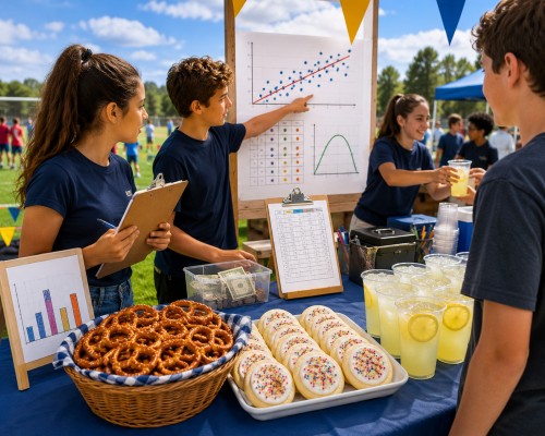
In the lab, students run a snack stand at a school Field Day selling three products. They use past sales data to answer the two business questions the whole unit is built around: what price to charge and how many to buy.
The three products are designed exactly along the lines described earlier. The first has clean, tightly clustered data that rewards a careful fit. The second hides a single outlier that students have to spot and exclude before fitting, which is the scatter-plot lesson made concrete. The third is genuinely loosely associated, and that is the teaching moment, because a student who over-trusts a loose model prices the product wrong, over-orders it, and watches the leftover stock eat into their profit at settle-up. The loss is small, traceable, and unforgettable.
The work moves through the same spine: plot the scatter and describe the association, fit a line and write the model as y = mx + b, feed the model into a profit curve and read the best price off the peak, place a single combined order inside a fixed budget, then watch the order meet a realistic Field Day that never quite matches the prediction. The lab ends with a settle-up that puts profit against a target and a two-way table debrief that ties grade level to what sold, closing out 8.SP.A.4. A light competitive framing, beating the profit target and comparing stands, gives the room its stakes.
Everything is auto-graded and the story carries the class, so it runs start to finish in two or three class days as a culminating statistics project. Teachers tend to reach for Snack Stand Showdown at the end of the unit, when students have the skills and need the reason they matter.
The Takeaway
Scatter plots and the line of best fit are not abstract. They are the everyday tools of anyone who has to set a price or stock a shelf, which is a genuinely useful answer to "when will I use this." Worksheets cannot deliver that answer, because they remove the decision that makes the line matter. Project-based learning puts the decision back, gives it a consequence, and lets students feel the difference between a good model and a sloppy one in the only currency that registers at thirteen: who came out ahead.
You do not need an elaborate setup to do this. You need data that carries a lesson, a decision that carries a cost, and steps that depend on each other. Build that, or borrow a project that already has it, and the hardest unit to make feel real becomes the one students remember.
TeachRealMath builds interactive, auto-graded math labs that turn Common Core standards into connected real-world projects for Grades 6 to 8. Explore Snack Stand Showdown and the full project library.