Skill PracticeGrades 7, 8· 20 min
Mean Absolute Deviation Practice
Practice calculating the Mean Absolute Deviation (MAD) of a data set step-by-step—starting from the mean, to absolute deviations, and finally to the MAD value.

Students put a data set in order, split it into halves, and find Q1, Q3 and the interquartile range one guided step at a time. Feedback names the exact mistake, and a number line shades the middle half once they get it right. 8 auto-graded questions, randomized for every student and aligned to 6.SP.B.5c. Assign it for a 20 to 30 minute practice block.
Interquartile Range Practice for Grade 6: Sort, Split and Find Q1, Q3 and the IQR
Finding the interquartile range is a sequence of small steps, and most students who get it wrong slip on one of them. They skip putting the data in order, they forget to leave the median out when the count is odd, or they pick the wrong value for Q1 or Q3. This interactive worksheet makes students do each step themselves and checks them as they go, so you can see where the method breaks down instead of only seeing a wrong final answer.
Each question uses a real-world data set, such as puzzle times, pets per home, screen time or points scored. Students:
What’s included
Standards alignment
Good for
Keywords: interquartile range worksheet, IQR practice, finding quartiles, Q1 and Q3, measures of variability, grade 6 statistics, 6.SP.B.5c, middle school data analysis, digital math worksheet, self-grading math activity
Students will find the interquartile range of a data set by putting the values in order, splitting them into a lower half and an upper half, finding the middle of each half (Q1 and Q3), and subtracting. They will see that the IQR measures how spread out the middle half of the data is, and use it to decide which of two data sets is more consistent.
Recognize that a measure of center for a numerical data set summarizes all of its values with a single number, while a measure of variation describes how its values vary with a single number.
All 6.SP.A.3 activities →Giving quantitative measures of center (median and/or mean) and variability (interquartile range and/or mean absolute deviation), as well as describing any overall pattern and any striking deviations from the overall pattern with reference to the context in which the data were gathered.
All 6.SP.B.5c activities →Informally assess the degree of visual overlap of two numerical data distributions with similar variabilities, measuring the difference between the centers by expressing it as a multiple of a measure of variability. *For example, the mean height of players on the basketball team is 10 cm greater than the mean height of players on the soccer team, about twice the variability (mean absolute deviation) on either team; on a dot plot, the separation between the two distributions of heights is noticeable*.
All 7.SP.B.3 activities →More interactive, auto-graded activities on the same standards and topics.
Practice calculating the Mean Absolute Deviation (MAD) of a data set step-by-step—starting from the mean, to absolute deviations, and finally to the MAD value.
Students will analyze five different data sets, each representing a real-life scenario such as weekly attendance or pages read by students. Their task is to calculate the mean, median, mode, range, and interquartile range for each data set, helping them develop essential skills in statistical analysis.
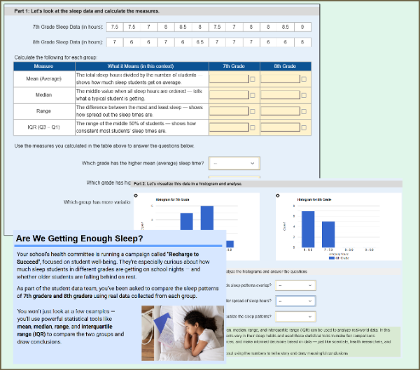
Students compare the sleep patterns of 7th and 8th graders using real-world data. They calculate mean, median, range, and IQR, then interpret histograms and make informal inferences about group differences. This worksheet supports randomization, so each student may receive different sleep data.
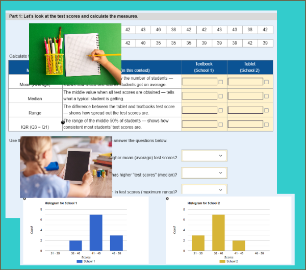
Students analyze test score data from two schools — one using tablets, the other using textbooks — to calculate mean, median, range, and IQR. They compare the distributions using numerical measures and histograms to draw conclusions about student performance.
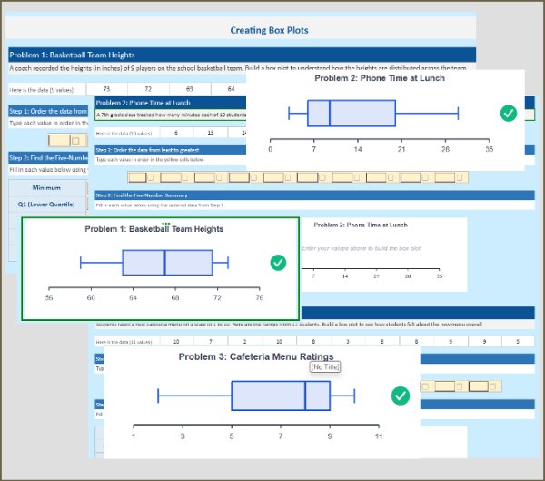
Build fluency with box plots through 3 real-world practice problems. Students sort data, find the five-number summary (Min, Q1, Median, Q3, Max), calculate IQR, and watch the box plot draw itself as they fill in each value. Each problem features a different distribution shape, with instant feedback when answers are correct.
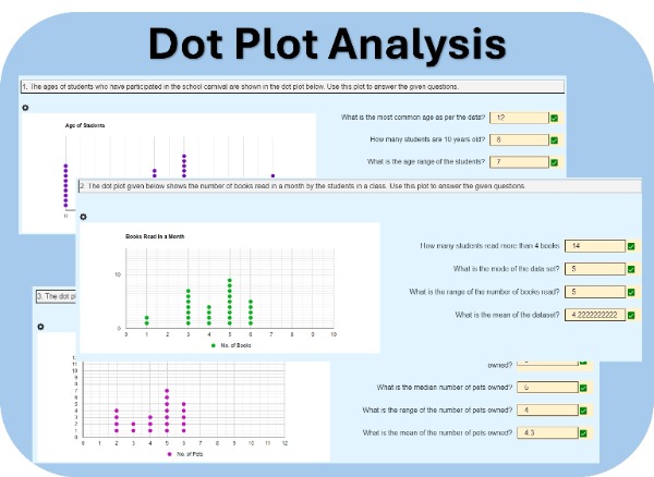
Students will analyze dot plots representing real-world data, such as the ages of students participating in a school carnival. They will answer questions based on these plots. Each student will receive three unique sets of data and questions, encouraging individual analysis and critical thinking.