Informally assess the degree of visual overlap of two numerical data distributions with similar variabilities, measuring the difference between the centers by expressing it as a multiple of a measure of variability. *For example, the mean height of players on the basketball team is 10 cm greater than the mean height of players on the soccer team, about twice the variability (mean absolute deviation) on either team; on a dot plot, the separation between the two distributions of heights is noticeable*.
9 interactive, auto-graded activities for 7th grade students practising 7.SP.B.3. Mini Labs put the standard to work in a real scenario; Skill Practice builds fluency on the standard alone. Every one is randomized per student, so each learner gets their own numbers.
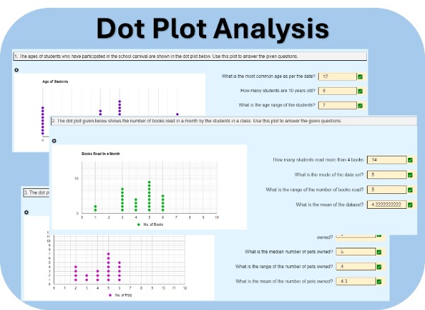
Students will analyze dot plots representing real-world data, such as the ages of students participating in a school carnival. They will answer questions based on these plots. Each student will receive three unique sets of data and questions, encouraging individual analysis and critical thinking.
This worksheet helps students identify outliers in scatter plots, calculate the mean with and without outliers, and analyze the impact on the average. It reinforces data analysis skills, helping students understand how outliers affect statistical measures like the mean.
Students will analyze five different data sets, each representing a real-life scenario such as weekly attendance or pages read by students. Their task is to calculate the mean, median, mode, range, and interquartile range for each data set, helping them develop essential skills in statistical analysis.
Practice calculating the Mean Absolute Deviation (MAD) of a data set step-by-step—starting from the mean, to absolute deviations, and finally to the MAD value.
Students will analyze four types of graphs: a scatter plot, a histogram, a bar chart, and a line chart. Their task is to interpret the data presented in each graph and answer specific questions related to the information.
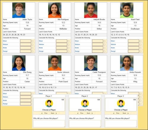
In this engaging worksheet, students analyze 8 sports players using real-world data. They calculate mean, median, mode, and range of game stats, then select the best 3 players for their dream team. A fun way to apply statistics in decision-making!
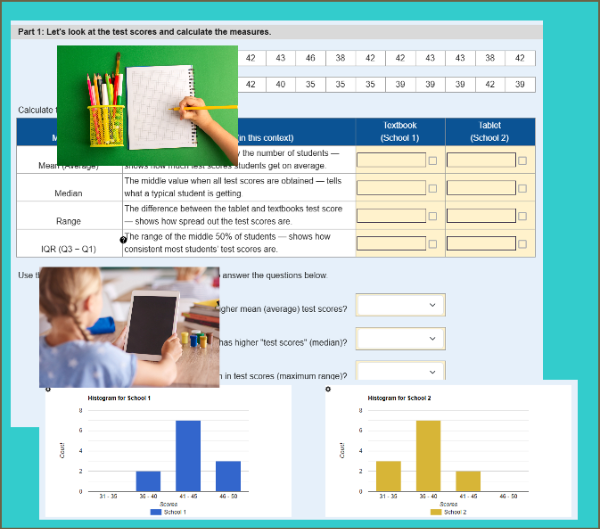
Students analyze test score data from two schools — one using tablets, the other using textbooks — to calculate mean, median, range, and IQR. They compare the distributions using numerical measures and histograms to draw conclusions about student performance.
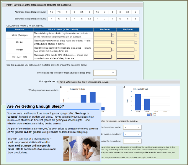
Students compare the sleep patterns of 7th and 8th graders using real-world data. They calculate mean, median, range, and IQR, then interpret histograms and make informal inferences about group differences.
This worksheet supports randomization, so each student may receive different sleep data.
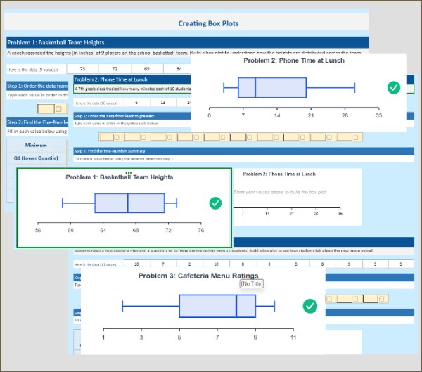
Build fluency with box plots through 3 real-world practice problems. Students sort data, find the five-number summary (Min, Q1, Median, Q3, Max), calculate IQR, and watch the box plot draw itself as they fill in each value. Each problem features a different distribution shape, with instant feedback when answers are correct.