Skill PracticeGrades 7, 8· 20 min
Mean Absolute Deviation Practice
Practice calculating the Mean Absolute Deviation (MAD) of a data set step-by-step—starting from the mean, to absolute deviations, and finally to the MAD value.

Help students understand real-world data with this 8th-grade scatter plot activity. Learners compare a data table to three scatter plots, identify associations, clusters, and outliers, and discover why scatter plots make patterns easier to see. A perfect introduction to bivariate data and the 8.SP standards.
This 8th-grade statistics worksheet helps students understand the power of scatter plots for analyzing real-world data. Instead of relying only on a data table, students explore three scatter plots that reveal patterns between teen lifestyle habits such as screen time, sleep hours, study time, test scores, exercise minutes, and calories burned. Learners identify associations, clusters, and outliers, compare graphs with the original data table, and explain why scatter plots make patterns easier to see.
This activity supports key CCSS 8.SP standards and builds foundational data literacy skills needed for high school math, science, and career pathways.
This worksheet gives students a meaningful, real-life context while strengthening their ability to interpret and communicate data insights using scatter plots.
Students will analyze bivariate data using scatter plots to identify patterns such as positive, negative, or no association, recognize clusters and outliers, and compare the effectiveness of scatter plots versus data tables in revealing relationships between variables.
Construct and interpret scatter plots for bivariate measurement data to investigate patterns of association between two quantities. Describe patterns such as clustering, outliers, positive or negative association, linear association, and nonlinear association.
All 8.SP.A.1 activities →
More interactive, auto-graded activities on the same standards and topics.
Practice calculating the Mean Absolute Deviation (MAD) of a data set step-by-step—starting from the mean, to absolute deviations, and finally to the MAD value.
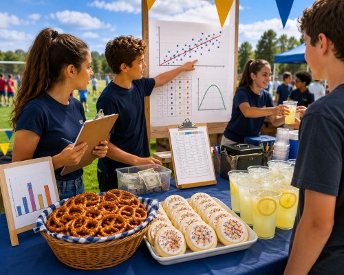
Snack Stand Showdown is a Grade 8 statistics lab where students run a Field Day snack stand and use real data to decide what to charge and how much to buy. They build scatter plots, fit lines of best fit, price from profit curves, place a budgeted vendor order, and read two-way tables. A connected, auto-graded arc covering the full 8.SP standard cluster.
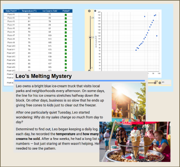
Help Leo, an ice cream truck owner, uncover how weather affects his sales! Students plot real data points to create a scatter plot, identify trends, and spot outliers. This engaging, hands-on activity builds understanding of correlation, trend lines, and data interpretation using a fun, real-world scenario.
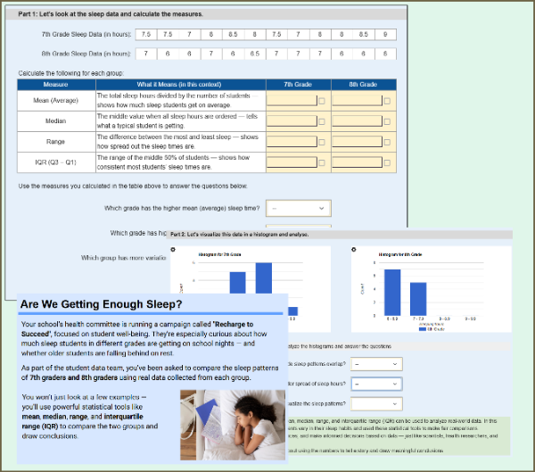
Students compare the sleep patterns of 7th and 8th graders using real-world data. They calculate mean, median, range, and IQR, then interpret histograms and make informal inferences about group differences. This worksheet supports randomization, so each student may receive different sleep data.
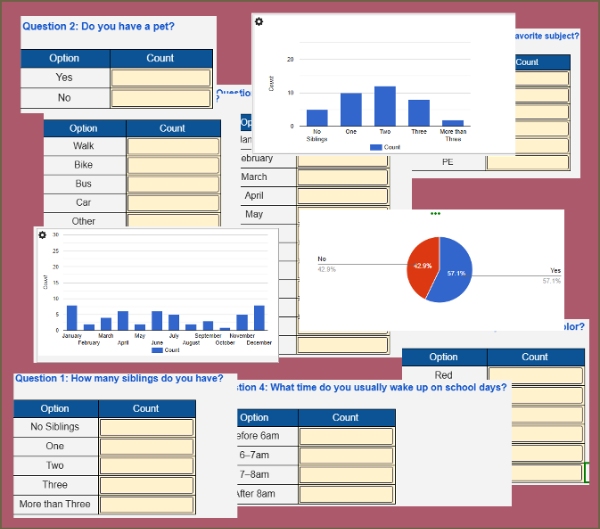
Students collect and summarize data from a live classroom survey on topics like pets, siblings, and school routines. As they enter values, interactive charts update in real time. Students then analyze the graphs and answer summary questions. A fun way to learn data collection and interpretation!
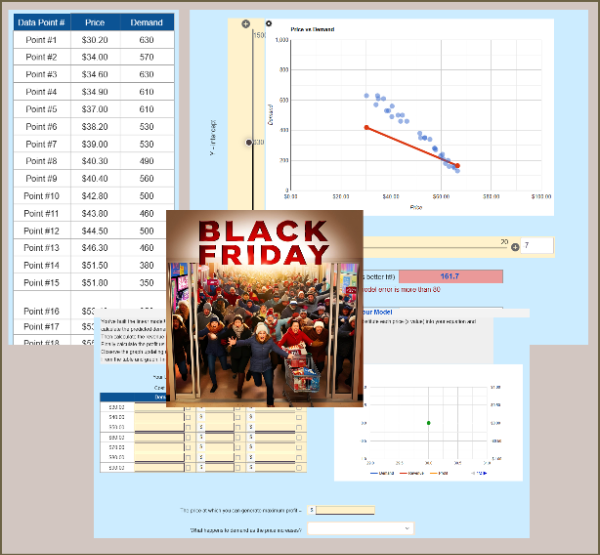
Students build a linear model from a price–demand scatterplot, then use it to predict demand, revenue, and profit at different price points. They analyze curves and determine the price that maximizes profit. A perfect real-world 8th-grade activity for scatterplots, linear modeling, and financial reasoning.